The Holoviz ecosystem is a suite of compatible tools designed to
make data visualization in Python easier and more powerful. It
supports every stage of data analysis, from importing and cleaning
data, exploring, hypothesis testing, generating accurate and
compelling diagrams, to sharing and deploying live applications.
The main features are as follows:
Multiple tools work together to smoothly visualize data and create interactive dashboards.
All tools are web browser compatible, providing the same usability in Jupyter notebooks and standalone applications.
Easy to use with a high-level API, and allows for detailed customization as needed.
Supports high-speed rendering of large-scale data and visualization of geographic information.
Representative components include the following:
HoloViews:
Separate data and its visual representation to easily create complex interactive diagrams
Panel:
Build interactive dashboards and web applications using only Python
hvPlot:
Easily create interactive plots from data structures such as pandas and xarray
Datashader:
Fast rendering of large datasets with millions of points or more
GeoViews:
Extend the visualization of geospatial data
Thus, Holoviz is built on top of the Python scientific and
technological stack and is an ecosystem that comprehensively supports
data visualization.
hvplot
hvplot is a high-level API developed as part of the Holoviz ecosystem
(Holoviews, Panel, Datashader, etc.) that allows you to visualize
pandas/xarray/Dask data directly.
Features of hvplot
Plot pandas dataframes with matplotlib in the same way as df.plot()
Automatically utilize Holoviews' powerful interaction features
Switch between multiple backends such as Bokeh / Matplotlib / Plotly
High-speed rendering of large datasets (millions of points) in conjunction with Datashader
Interactive operation in Jupyter / Colab / VS Code
In particular, it is strong in meeting the need for "interactive
visualization without increasing the amount of code."
Basic Structure of hvplot
hvplot operates as an extension of pandas.
import hvplot.pandas
This alone adds the .hvplot method to pandas DataFrames/Series.
By default, Bokeh is used as the backend, but you can also specify
matplotlib.
Basic Examples
!pip install hvplot
import pandas as pd
import matplotlib.pyplot as plt
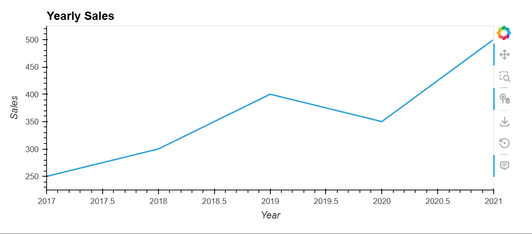
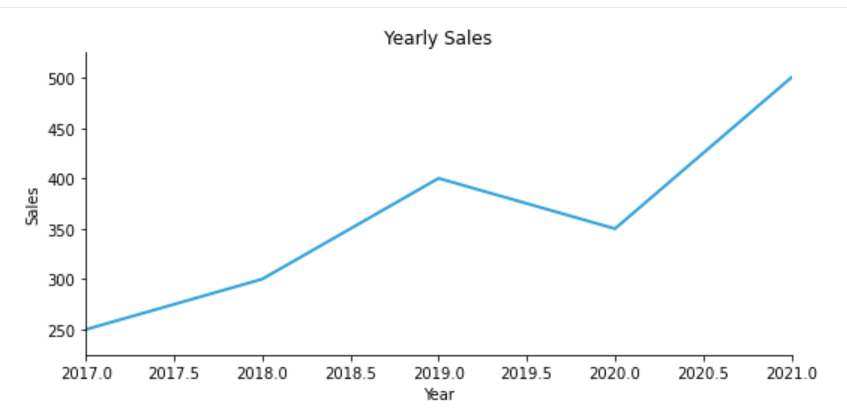
# Sample DataFrame
data = {'Year': [2017, 2018, 2019, 2020, 2021],
'Sales': [250, 300, 400, 350, 500]}
df = pd.DataFrame(data)
# Plotting a line graph
df.plot(x='Year', y='Sales', kind='line')
plt.xlabel('Year')
plt.ylabel('Sales')
plt.title('Yearly Sales')
plt.show()