df=pd.DataFrame({'x':[1, 2, 3, 4, 5], 'y':[4, 7, 1, 6, 3]})
plot=df.hvplot.scatter(x='x',y='y',marker='circle',color='navy',alpha=0.5,size=10)
plot.opts(width = 400, height = 400)
plot
Learn how to create graphs using Bokeh with an API similar to matplotlib by using hvplot.
The Python Bokeh library is an advanced data representation library. It has various functions and offers significant advantages over matplotlib. However, because it is advanced, its usage differs from matplotlib.
Therefore, the holoviz ecosystem provides hvplot, which enables the use of Bokeh with an API similar to matplotlib.
This text will teach you how to create graphs using Bokeh with hvplot.
When using Bokeh with hvplot, install bokeh and hvplot using pip.
pip install bokeh
pip install hvplot
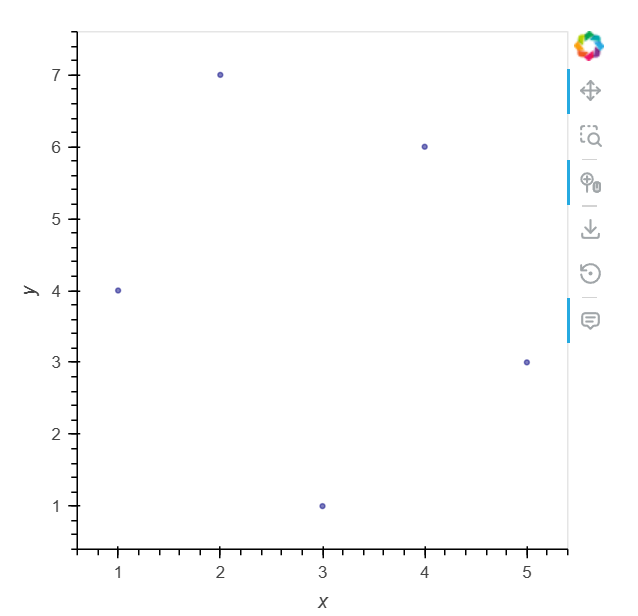
A scatter plot is a graph that plots circles at given x,y coordinates.
First, import the necessary libraries.
! pip install hvplot
import pandas as pd
import hvplot.pandas
Create a pandas DataFrame and specify the data column names x and y using hvplot's scatter. When plotting with hvplot, if nothing is specified, the plotting backend will automatically be bokeh.
df=pd.DataFrame({'x':[1, 2, 3, 4, 5], 'y':[4, 7, 1, 6, 3]})
plot=df.hvplot.scatter(x='x',y='y',marker='circle',color='navy',alpha=0.5,size=10)
plot.opts(width = 400, height = 400)
plot
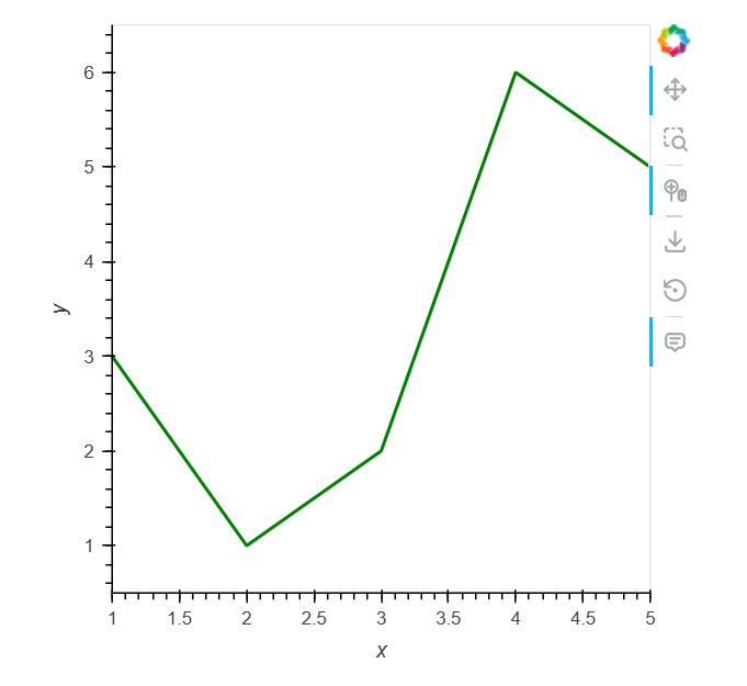
A line graph represents changes in data by connecting each x and y coordinate. In particular, it can represent changes in data at each time point in time series data.
Similar to scatter, create a Pandas DataFrame and specify the data names representing the x and y coordinates using the line method.
df = pd.DataFrame({'x':[1, 2, 3, 4, 5],'y': [3, 1, 2, 6, 5]})
plot=df.hvplot.line(x='x',y='y',width = 2, color = "green")
plot.opts(width = 400, height = 400)
plot
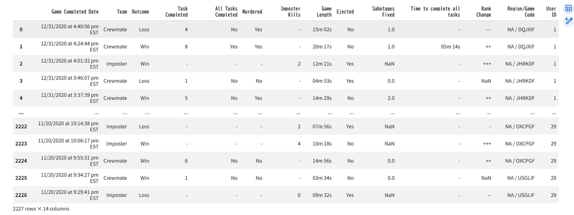
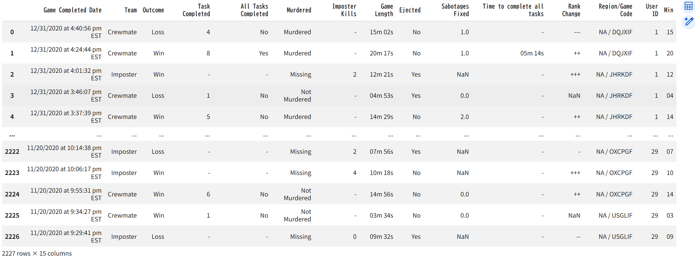
Next, we will create a graph using a large dataset. We will use the "the among us" dataset from Kaggle. This represents the results of 2227 games played by 29 users.
We will import 29 data points from Kagglehub and combine them into a single DataFrame.
import glob
import kagglehub
path = kagglehub.dataset_download("ruchi798/among-us-dataset")
all_files = glob.glob(path + "/*.csv")
li = []
usr=0
for filename in all_files:
  usr+=1
  df = pd.read_csv(filename, index_col=None, header=0)
  df['User ID']=usr
  li.append(df)
  df = pd.concat(li, axis=0, ignore_index=True)
df
The imported data is as follows:
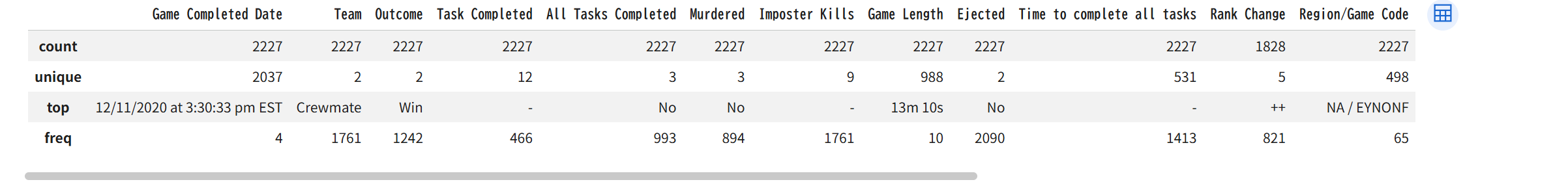
This displays basic information about a Pandas DataFrame using the `describe` method. Specifying `include='O'` (uppercase O) will display information about the object, such as a string.
df.describe(include='O')
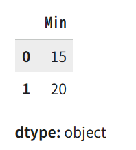
`Game Length` represents the duration of each game. The column contains minutes and seconds. We will extract this data into a column called `Min`, containing only the minutes.
df['Min'] = df.apply(lambda x : x['Game Length'].split(" ")[0] , axis = 1)
df['Min'] = df['Min'].replace('m', '', regex=True)
df['Min' ][ : 2]
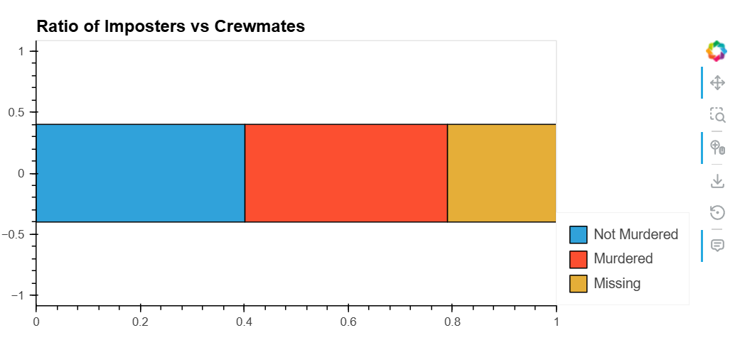
The "murdered" column only contains "yes" and "no". Therefore, we replace it with the values "Murdered", "Not Murdered", and "Missing". The final dataset will look like this.
df.replace({'Murdered':{'No':'Not Murdered', 'Yes':'Murdered', '-':'Missing'}} ,inplace=True)
df
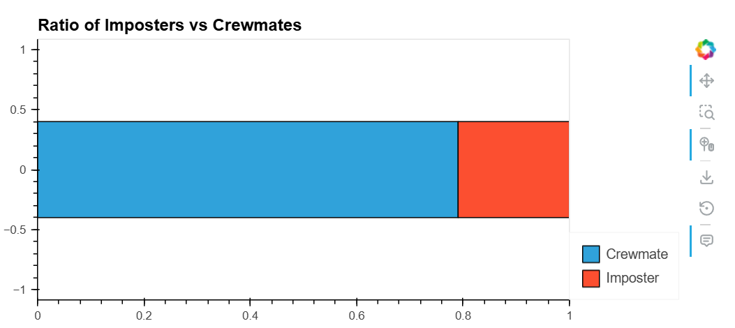
Currently, hvplot does not support pie charts. Here, we introduce the stacked bar chart `barh` as a graph to represent proportions.
To show proportions in a dataset, use a stacked bar chart where the total is set to 1. (Other options include pie charts, but these are not supported by hvplot).
To create a graph of proportions, use the `.value_counts(normalize=True)` method on the specific column of the dataframe to aggregate and normalize the proportions, outputting them as a Series. Then, create a DataFrame with an array of dictionaries created using the `to_dict()` method. Finally, plot this using `barh` with `stacked=True` specified.
df_team = df.Team.value_counts(normalize=True)
df_plot = pd.DataFrame([df_team.to_dict()])
df_plot.hvplot(kind = 'barh', stacked=True, title = 'Ratio of Imposters vs Crewmates')
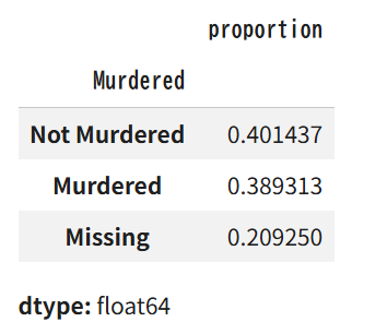
Similarly, create a DataFrame for the Murdered column.
df_mur = df.Murdered.value_counts(normalize=True)
df_mur
Similarly, draw a stacked bar chart.
df_mur_plot = pd.DataFrame([df_mur.to_dict()])
df_mur_plot.hvplot.barh(stacked=True, title = 'Ratio of Imposters vs Crewmates')
A histogram divides numerical data into several ranges and measures the frequency. The height of the graph represents the frequency.
Here, we will create a histogram for the Min column of the game time created earlier.
df_minutes = df['Min'].astype('int64')
df_minutes.hvplot(kind='hist', title='Distribution of Minutes')
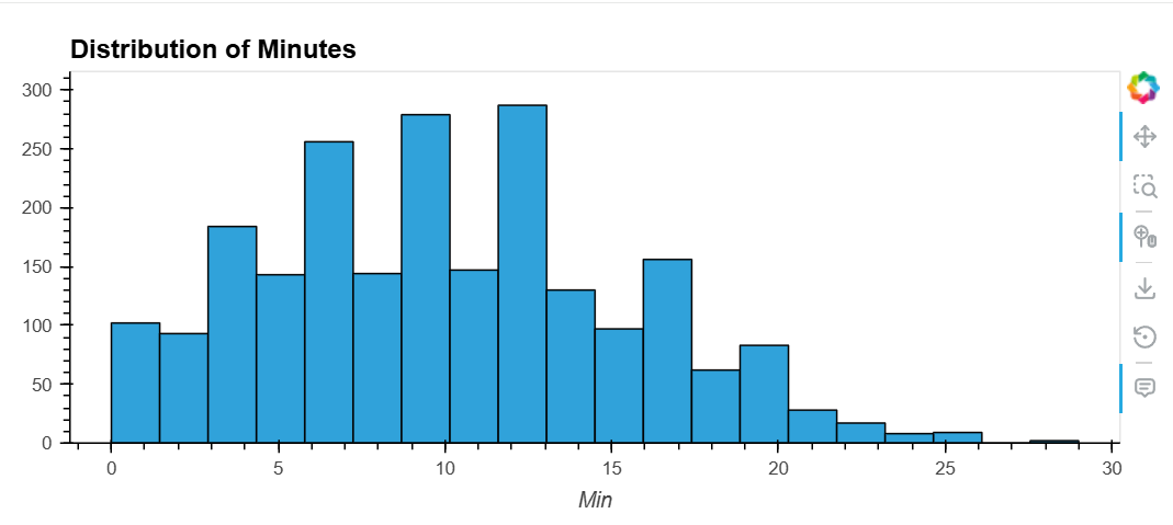
This graph shows that many games are completed in 6-14 minutes.
To better represent segmented data, use different colors. The crosstab method can be used to process segmented data.
df_gm_te = pd.crosstab(df['Game Length'], df['Team'])
df_gm_te.hvplot.hist(title='Game Length vs Imposter/Crewmate', width=750,height= 350)
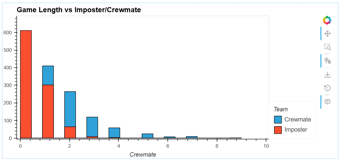
This shows that the distribution differs for each team.
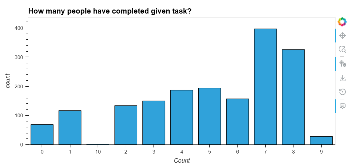
Histograms show the distribution of numerical data, while bar graphs show the distribution of typed data. They can also be stacked.
The bar method is used to create a bar graph. The bar graph below shows the number of people in a team.
df_tc = pd.DataFrame(df['Task Completed'].value_counts())[1:].sort_index().rename_axis('Count')
df_tc.hvplot(kind='bar', title="How many people have completed given task?", width=750,height= 350)
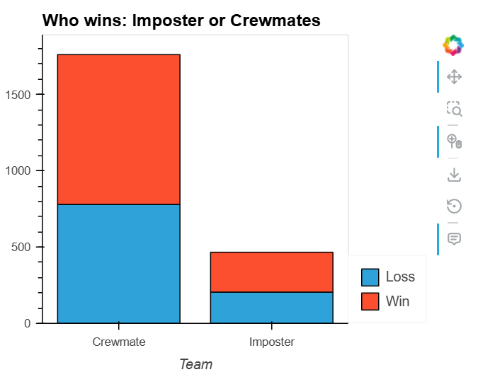
Next, we'll show a stacked bar chart illustrating the win-loss record for each team. This is done by setting the `stacked` attribute to True.
df1 = pd.crosstab(df['Team' ], df['Outcome'])
df1.hvplot.bar(title='Who wins: Imposter or Crewmates',stacked=True,width=450,height=350)
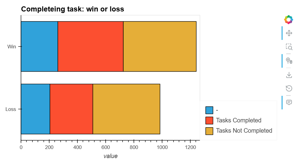
Use the barh method to create a horizontal bar graph. Here, we'll display the results and tasks together.
df2=df.replace({'All Tasks Completed':{'Yes':'Tasks Completed', 'No': 'Tasks Not Completed'}})
df3 = pd.crosstab(df2['Outcome'], df2['All Tasks Completed'])
df3.hvplot.barh(title='Completeing task: win or loss',
stacked=True,
width=650,height= 350)
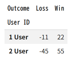
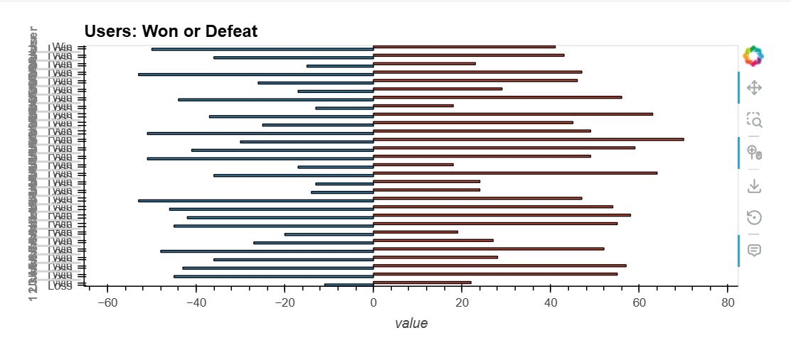
The other graph is a vertically stacked bar graph. One bar will be negative and the other positive.
df_user = pd.crosstab(df['User ID'], df['Outcome']).reset_index()
df_user['Loss' ] = df_user['Loss'] * -1
df_user['User ID'] = (df_user.index+1).astype(str) + ' User'
df_user = df_user.set_index('User ID')
df_user [:2]
The graph below shows the win/loss record for each user ID.
df_user.hvplot.barh(title='Users: Won or Defeat')
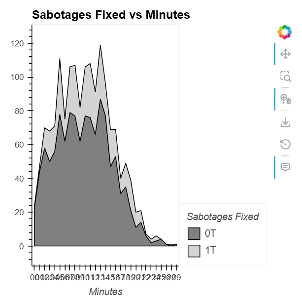
An area chart is a combination of a line graph and a bar graph. Using an area chart, you can see how different groups change over time.
You can display an area chart by setting the stacked attribute to True in the hvplot.area method.
df_min = pd.crosstab(df['Min'], df['Sabotages Fixed']).reset_index()
df_min = df_min.rename(columns={0.0:'0T', 1.0:'1T',2.0:'2T',3.0:'3T',4.0:'4T',5.0:'ST'})
# chart

df_min.hvplot.area(x='Min',y=['0T', '1T'], stacked=True,
    width=400, height=400,
    title='Sabotages Fixed vs Minutes',
    xlabel='Minutes',
    color=['grey', 'lightgrey']
).opts(
    show_grid=False,
    legend_position='right'
)
This section explains how to display multiple graphs together. Bokeh provides a Web Interface for displaying graphs and other elements. To use this feature in Jupyter Notebook or Google Colab, you need to use the `panel` package, which provides this interface. Therefore, first, install the following module to use this feature.
!pip install jupyter_bokeh
Then, import panel as follows and specify that it should be reflected in note.
import panel as pn
pn.extension()
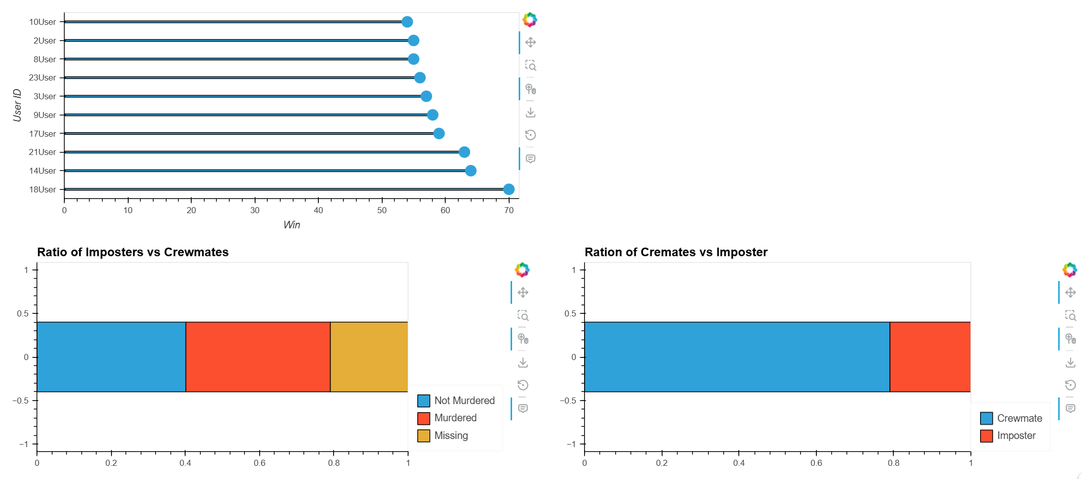
First, we will create several example graphs. Using the data we have so far, we will create plotg11, plotg12, plotg2, and plotg3.
df_user_new = pd.crosstab(df['User ID'], df['Outcome']).reset_index().sort_values(by='Win', ascending=False)[:10]
df_user_new['User ID'] = (df_user_new.index+1).astype(str) + 'User'
x = df_user_new['Win']
factors = df_user_new[ 'User ID']
plotg11=df_user_new.hvplot.barh(x='User ID',y='Win',bar_width=0.1)
plotg12=df_user_new.hvplot.scatter(x='User ID',y='Win',size=200)

plotg2=df_mur_plot.hvplot.barh(stacked=True, title = 'Ratio of Imposters vs Crewmates')

df_team = df.Team.value_counts(normalize=True)
df_team_plot = pd.DataFrame([df_team.to_dict()])
plotg3=df_team_plot.hvplot.barh(stacked=True, title = 'Ration of Cremates vs Imposter')
This explains how to combine the graphs you have created into a single figure.
# Styling
row=pn.Row(plotg2,plotg3)
layout = pn.Column(plotg11*plotg12,row)
layout
Bokeh provides a web interface, allowing you to create web pages that display interactively manipulated graphs by outputting the results to a file.
To illustrate, import the necessary modules.
import pandas as pd
from bokeh.models import ColumnDataSource,HoverTool
from bokeh.plotting import output_file,figure,show
from bokeh.transform import factor_cmap
from bokeh.palettes import Blues8
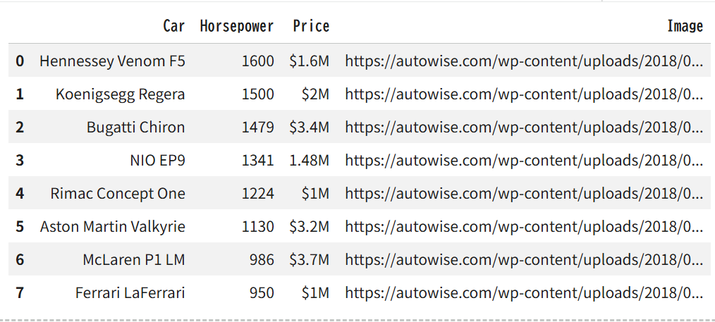
Next, we load the data related to cars. Since we will be handling it directly with Bokeh this time, we provide a pandas DataFrame to the Bokeh data structure, ColumnDataSource.
url='https://raw.githubusercontent.com/bradtraversy/python_bokeh_chart/master/cars.csv'
df = pd.read_csv(url)
# Create ColumnDataSource from data frame
source = ColumnDataSource(df)
output_file('index.html')
# Car list
car_list = source.data['Car'].tolist()
The data contents are as follows:
df
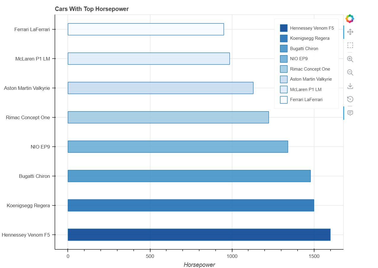
Next, although we haven't shown it until now, we will draw the graph using Bokeh's functions directly. To do this, we create a Bokeh figure object as the drawing target, and then draw the graph on that object using the hbar method. We specify a ColumnDataSource for the y attribute.
# Add plot
p = figure(
y_range=car_list,
width=800,
height=600,
title='Cars With Top Horsepower',
x_axis_label='Horsepower',
tools="pan, box_select, zoom_in, zoom_out, save,reset"
)

# Render glyph
p.hbar(
y='Car',
right='Horsepower',
left=0,
height=0.4,
fill_color=factor_cmap(
'Car',
palette=Blues8,
factors=car_list
),
fill_alpha=0.9,
source=source,
legend_field='Car'
)

# Add Legend
p.legend.orientation = 'vertical'
p.legend.location = 'top_right'
p.legend.label_text_font_size = '10px'
Finally, by adding a hover box and HTML source and displaying it with `show`, it will be output to a file.
# Add Tooltips
hover = HoverTool()
hover.tooltips = '''
<div>
    <h3>@Car</h3>
    <div><b>Price: </b>@Price</div>
    <div><b>HP: </b>@Horsepower</div>
    <div><img src="@Image" alt="" width="200" /></div>
</div>
'''
p.add_tools(hover)
# Show results
show(p)
When you view the generated HTML file in a browser, the following graph will be displayed.
Bokeh is a data display library specifically designed for web interfaces. By using it in conjunction with hvplot, it can replace Matplotlib. Furthermore, using Bokeh's functions directly allows for more interactive and feature-rich data displays with web interfaces.
To customize the appearance of your Bokeh plot, you can use various styling options provided by Bokeh. You can modify the properties of plot elements such as axes, grids, legends, and the plot area itself. For example, you can set the `title’,’ x_axis_label’, and `y_axis_label’ properties to add descriptive titles and axis labels. You can also customize the appearance of glyphs (the visual shapes that represent your data points) by setting their attributes, such as `color’, `size’, `alpha’ (transparency), `line_color’, `line_width’, `fill_color’, and more. Additionally, you can use the `theme’ feature to apply a consistent style across your plots. The layout and position of plot components like legends and toolbars can also be adjusted to suit your preferences. Combining these customization options allows you to create visually appealing and informative plots tailored to your specific needs.
Whether Bokeh is better than Matplotlib depends on your needs and use cases. Bokeh and Matplotlib are powerful visualization libraries that serve different purposes. Matplotlib is well-established and excels in creating static, publication-quality plots with fine-grained control over all plot aspects. It's ideal for creating detailed and complex visualizations for research and analysis.
Bokeh, on the other hand, is designed to create interactive and web-friendly visualizations. It allows users to create plots easily embedded in web applications and provides dynamic interactions like zooming, panning, and tooltips. If your primary goal is to create interactive, web-based visualizations, Bokeh is likely the better choice.
However, if you need high-quality static plots for detailed analysis and publication, Matplotlib might be more suitable. Ultimately, the choice between Bokeh and Matplotlib depends on the specific requirements of your visualization project.
It depends on your requirements whether Bokeh or Plotly is superior. Bokeh is perfect for intricate, interactive plots because of its exceptional adaptability and web application integration. In contrast, Plotly is easy to use, provides many pre-built chart styles, and facilitates rapid, excellent interactive visualizations. Select Plotly for user-friendliness quick creation of interactive charts, and Bokeh for extensive customization and web app connection.